Chart Patterns – What They are and How to Trade Them
Subscribe
Dear Traders,
many traders use chart patterns for analyzing markets and entering setups. This apparent order within market structures is a fascinating phenomenon. If understood properly, chart patterns become a very valuable trading tool.
This article will discuss the nature of chart patterns and what to be aware of when trading them.
How do Chart Patterns Form and Why can they be Predictive?
As we start out trading, it usually doesn’t take long before we come across the idea of chart patterns. Lots of people talk about triangles, flags, wedges and so on. But it is often less understood how and why repetitive chart patterns actually form, and by extension, how it is possible for them to be predictive of future price action.
Chart Patterns – A Mirror of Market Psychology
All price moves are a reflection of collective market psychology, i.e. the sum total dynamic choice, of all market participants (including robots/AIs), are represented by the quality of candles that form in any moment in time and on any time frame.
Price-action therefore is the most direct reflection of investor dynamics, very much like a seismograph represents the overall movements of the earth on a chart.
As price moves unfold in the form of more and more candles, one can attempt to analyze them into meaningful patterns that indicate something relevant about the prevailing market dynamics, which can give early clues for future price moves. Chart pattern observations have been made for a very long time. Many of them have lot of correlation behind them, which has made them relatively reliable for trading purposes.
It can be useful to have a grasp on what the investors’ dynamic is that underlies each chart patterns. It is easy to jump straight into trading patterns, without understanding what investor dynamics they actually reflect. Knowing something about this can ground you into a deeper understanding of what you are seeing on a chart, which can provide an additional edge to your trading. So let’s have a look at a couple of patterns that look similar but have totally different investor dynamics behind them.
Wedges
Wedge patterns appear quite frequently in charts. I am using a rising wedge example in this case but the same applies to falling wedges, only in reverse.
A rising wedge consists of price moving between two ascending trend lines, only that the lower line is rising faster than the upper line, causing a narrowing (wedge) shape. They happen at the end of an uptrend. We can see that price is wanting to rise, but higher highs cannot be established proportionally to the higher lows.
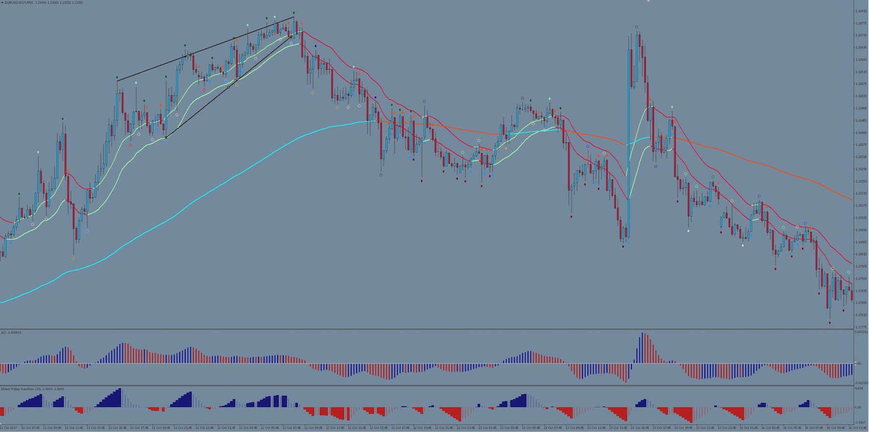
The example above is of a rising wedge in the EUR/USD chart. This pattern indicates strongly that a major portion of buyers has stopped participating and only a reduced number of investors want to continue to buy at these prices. They manage to drive price higher, but less and less so, and thus, causing the narrowing of the pattern. The lower trend line (indicative if buying sentiment) rises faster because even though buyer numbers are dwindling, there aren’t yet enough other investors who are taking profits, thereby allowing the price to rise still, in spite of fewer buyers. But profits are being taken increasingly too, and perhaps new sellers are coming in as well, which is why the upper trend line (indicative of selling/profit taking sentiment) is not allowing price to rise in equal measure anymore. Eventually a tipping point happens at the narrowest point of the wedge when profit taking and new sellers utterly overwhelm the last remaining buyers and price breaks downward.
Barrier Triangle
Barrier Triangles look very similar to wedges but there are subtle differences, which mean that significantly different investor dynamics are in play.
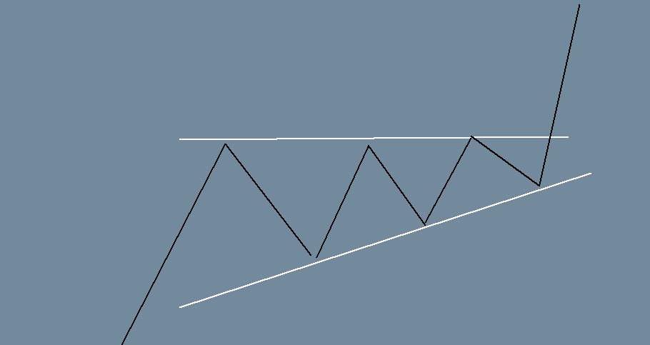
An ascending barrier triangle has also a rising lower trend line but, the upper trend line is horizontal instead of sloped. So what does this say about investor dynamics that is different from the rising wedge?
Here we have a situation where buyers are being blocked by a wall/barrier of sellers who are lurking at a key price level (horizontal line), which is why price is bouncing repeatedly at the same horizontal level. It’s a bit like a group of people trying repeatedly to bash down a gate and break through it. However unlike in the wedge pattern situation, there are less and less sellers who put up resistance against the onslaught of buyers, which is reflected in the fact that price is dropping less and less after every failed attempt to break the horizontal resistance (i.e. rising lower trend line). Buyers eventually overwhelm the dwindling numbers of sellers, and thus, the break upwards occurs.
Elliott Wave Theory: An Advanced Form of Pattern Trading
As you can see from the example above, it is easy to mistake one pattern for another. Often price can ‘sort of’ look like a certain pattern when it may have nothing to do with it. It’s easy to draw some rough trend lines and believe that one has found a chart pattern, but this loose approach can often backfire on us.
The devil is certainly in the detail when it comes to chart patterns analysis. That’s where Elliott Wave rules come into their own. Elliott Wave theory has some quite precise set of rules that either confirm or invalidate a wave/chart pattern. One could therefore call it a kind of advanced form of chart pattern trading, which goes a step further than just drawing the trend lines. If you are interested in trading chart patterns, I can only recommend you familiarize yourself with Elliott Wave theory as well because it will most likely improve your pattern trading skills.
Chart Patterns are Not a Dead Cert
Although many chart patterns are surprisingly reliable for predicting the next price move, they are not a dead cert either. That’s because they can morph seamlessly into a different pattern from what one might have expected. We can only ever know for sure what pattern has formed in hindsight because by the time it is 100% confirmed, the trading opportunity it would have provided is already over.
This uncertainty has to do with the nature trading itself. Trading essentially means to interact with a field of potentiality. This might sound a bit ‘woo-woo’, but let me explain.
A concept found in quantum physics has a remarkable parallel to chart patterns and trading. It is called ‘wave function collapse’. Put very simply, wave function collapse is the moment when a particle of matter first becomes measurable or definable in any way (i.e. it ‘collapses’ from a potential into something observable). Prior to that, it is exists more in an undefined state of potentiality, where it could still turn out to be one of several things. However quantum mechanics can to certain degree predict in advance how a ‘wave’ will collapse into a particle.
We engage in a very similar process when we trade chart/wave patterns. We can predict what price is going to do next to a certain degree. But the pattern will never be 100% confirmed until after it has played out. There is a certain sweet spot; a moment when just enough price-action has played out to validate our analysis, while it is also still early enough to make the trade entry viable. That’s why it is better to be more selective with the setups you choose (i.e. choose only the best).
Once we are committed, we have to trust in the quantum vacuum, the field of potentiality, to deliver the final result 🙂
All the best along your trading journey
Hubert
.


Leave a Reply